My inky travels along life's rocky road
Showing posts with label CP Monthly Challenge. Show all posts

Wednesday, 28 April 2021

Monthly Challenge - April


 For the penultimate month of the monthly challenge the theme is:

                                                         Y for Yesterday

The colour option is yellow.

I struggled with this one and I'm not sure I hit the brief but I was going for a vintage/ancestors vibe. I started off with a piece of card sprayed with Glimmer Mist in peach. I don't know if anyone remembers but Glimmer Mists were one of the early shimmer sprays on the market. They were notorious for clogging nozzles and I have 3 or 4 of these sprays (I think I won them in a competition) which have barely been used despite repeated efforts to clear the nozzles. I was about to recycle an empty bottle of blow-dry spray when I thought I would see if the Glimmer Mist would work in it. It worked so now you will find peach Glimmer Mist on many projects and I am waiting to decant another colour in another empty spray bottle.

Anyway back to the above project on which I then used a TH clocks stencil with mustard seed DI. I edged the top and bottom with brushed corduroy DI and stamped the text from Paper Artsy Ancestors plate 3. The 2 images are from the same set and I used a new rectangle die set to cut them out. The male image didn't have a defined frame so I cut a rectangular frame and coloured it in black. The shield which is raised on foam tape is the waste from the stamped images and the mopping up of excess brushed corduroy DI on my craft sheet which I used to watercolour the image backgrounds. The die is from a Sizzix set and I added some mustard seed DI and edged it in black.

The flower spray is a die cut I had on my desk (I think it's one of the TH wildflowers). I coloured it with alcohol markers and added glossy accents to the flowers.

Next month is the last letter in our challenge!


Thursday, 25 March 2021

Monthly Challenge - March


 This month's letter is:

                             P for Patchwork

The colour options are Pink, Purple and Platinum.

Last year on my way home from a trip to London I bought a set of dies from a charity shop. They were Crafter's Companion patchwork dies and at £1 each for a set of 2 dies I thought they would be useful for my papercrafting so I bought all 4 sets. At the time I had no idea that we would go into lockdown shortly after and that would be my last trip to London for a long time.

I remembered these dies when the theme for this month's challenge came up and decided to use the clam shell die. I collected 5 different patterned paper scraps in pinks and purples and used the die to cut multiple shapes of each one. The purple ones were run through a lace embossing folder, one of the pink papers was stamped with a Crafty Individuals text stamp in Brilliance platinum planet and a small flower was stamped in Versamark onto the lilac shapes and perfect pearls brushed on top.

I worked out how to arrange them and then stuck them down onto a piece of card. Not  having thought further than that I looked at the card and couldn't think what to add to it for the focal point. Finally I had an idea - an old Tim Holtz stamp and die set called framed silhouettes. I cut the frame from some card on which I had added some silver sticky back foil. I didn't want to use the stamp that goes with it but wanted to add some texture to the frame which I did with a 3D embossing folder called floral mandala. I added another plain frame at the back for some more dimension. I stamped the portrait in Versafine onyx black and die cut it (I should have just cut it out from black card). Finally I added a die cut word from Tim Holtz script friendship words.

Thursday, 11 February 2021

Monthly Challenge - February


This month the letter is:

                                    I for Insect

Colour options are Indigo and Ivory.

I used an Ivory base card and Indigo on the butterfly. The background was made with a piece of tissue paper which I crumpled, smoothed out and rubbed with speckled egg DI. I used an old stamp from a Katy's Corner grab bag which shows the life cycle of some sort of insect (fly? ant? I have no idea) and a text stamp by Paper Artsy with Memento gray flannel. I mounted this onto the ivory card. The butterfly and flower are from a stamp and die set by Dare 2 B Artzy called Butterfly Tangle. I stamped them both with Versamark and heat embossed with Blonde Moments sweet cool iridescent embossing powder and then coloured them in with alcohol markers. The main quotation is from Darkroom Door's Wildflowers vol 1 stamped with Versafine onyx black and clear heat embossed. Some elements were mounted on foam pads.

Friday, 15 January 2021

Monthly Challenge - January


 This month's letter is:

                              Z for Zigzag

The colour option was Zucchini which I just about managed to get onto the postcard this month.

I had other ideas for this month's entry but then I saw an offer for a die set by Pretty Quick that looked like it had been made for this challenge. It's called the chevrons panel and is a set of 4 dies - an outline which I didn't use, an inner panel that cuts the main zigzags with the circle, a circle die and the Hello sentiment. There was also a matching stamp set that has some sentiments and a floral stamp that fits in the circle which also fell into my basket!

With the miserable weather we've been having I felt the need for some hot colours so I blended mustard seed, spiced marmalade and gathered twigs DIs onto some white card and die cut it with the chevron die. I backed it with some splatter patterned paper and used some extra paper to cut a circle which I embossed with a flower embossing folder. The 'Hello' was cut from the circle waste. I diecut some flower layers in different patterned papers and edged the petals and leaves with the same DIs. These were stacked up and curled to add dimension and a punched stamen and tiny gem added.


Wednesday, 16 December 2020

Monthly Challenge - December


This month the letter is:    

                       C for Christmas

I completely forgot about the colour options which are Crimson, Cobalt and Copper.

It took a while for this to come together but I'm pleased at the way it did. I thought long and hard about what I wanted to depict on the theme of Christmas - I have lots of Christmas tree, bauble, holly and present stamps but I didn't want to use any of them. Then I remembered a nativity die set that was a freebie with a magazine and I found a Hobbycraft stamp set of the 3 Kings. The background was made with blended stormy sky, blueprint sketch and dusty concord DIs. I then splattered some silver acrylic paint for a starry sky.The nativity set included the shepherd, star and palm trees (there was also a camel but I didn't need that). I die cut all the parts I needed from black paper and the star from glitter card. I stamped the 3 Kings with my stamping platform and Versafine onyx black. The hills are from a Sizzix build a landscape set, I highlighted the curves with a Wink of Stella pen. The sentiment is a stamp I had made a long time ago.


Wednesday, 25 November 2020

Monthly Challenge - November


 As a break from all things Christmas I finally completed my entry for the monthly alphabet challenge. The letter this month is : 

                                                                 K for Kiss

Colour options are Kelly Green and Khaki both of which are in this somewhere.

My original plan was more human-based and romantic but then I found this old frog/toad on a leaf stamp that I think I got years ago in a grab bag. Given the colour options this month a frog sounded like the perfect image and then I remembered this quote about kissing toads to find your prince. I stamped and masked the frog and leaf and then created some water and sky with DIs - tumbled glass, shabby shutters and salty ocean. The 'water' had a stencil and peacock feathers added to it to give a sort of rippling effect. The main image was coloured with Coloursoft pencils and solvent. The stitched clouds are from a Sizzix landscape set and the reeds are by Craft Emotions cut from a scrap of card. I hand cut a gold crown and printed out the quotation. Now back to Christmas...

Thursday, 8 October 2020

Monthly Challenge - October


 This month's letter is:               

                                    N for Number

The only colour choice was Navy Blue (but I haven't used it).

I decided to give my Tim Holtz Umbrella Man an airing - I'd love to say it was because he has lots of numbers on him but that was pure coincidence. With the help of my stamping platform and Versafine onyx black I was able to stamp all the detail clearly. After masking the image I revived some excess ink (it may have been twisted citron Oxide) that was on my plastic mat with a few spritzes of water and ran the card through it. When dry I added a small flourish, another TH image, randomly over the card with pumice stone DI. This was followed by a couple of Paper Artsy number stamps with a Kaleidacolor ink pad and Versafine onyx black. Finally I filled in some gaps with a TH dot stencil and Impress poppy red. I removed the mask and added the text in Memory Box's Parker font.

Sunday, 6 September 2020

Monthly Challenge - September


 This month the letter is:

O for Owl

Colour options are orange, olive and ochre and I managed to use all of them for once.

My biggest problem was how to shoehorn my newest toy - the wreath builder - onto the postcard. I knew which set I wanted to use, the Sizzix Autumn Owls stamp and die set. It has the excruciating sentiment 'Owl always love you' but I decided to avoid that. I used the smaller of the 2 owl stamps and stamped it first in Archival tangelo bright (orange) then sepia and then I cut out the owls leaving a small border. The background was made with smooshed crushed olive DI and Archival butterscotch (ochre-ish). I used the butterscotch with a Memory Box falling leaves stencil and then used the TH rays stencil with tea dye DI over both halves. I added some narrow washi tape where the 2 halves met. The 'leaves' were made from a Sizzix die and an X Cut feather die set. I added an eyelet? washer? (can't remember what they're called) to the centre. 

Thursday, 13 August 2020

Monthly Challenge - August


I'm definitely in a cute frame of mind with this month's monthly challenge. The letter is

                                                             S for Summer

The colour options are scarlet, salmon and sepia.

I had a completely different idea for this - more vintage using a Crafty Individuals stamp with beach huts but I realised I'd not used this Sizzix/My Life Handmade die set called Great Outdoors. I've been reading a lot in the Press about staycations and camping and the caravan die in this set came to mind. All the die cuts came from this set including the 'hello' sentiment.

I watercoloured some stripes onto watercolour paper and then added the die cuts made mostly from scraps on my desk. I coloured the hearts and other bits with alcohol markers. The 'summer' text was stamped with some old peg alpha stamps onto patterned paper and then punched out with a small circle punch. I added Glossy Accents onto the letters for a little dimension. The windows and the hearts were given a coat of Wink of Stella for a little shimmer.

Sunday, 2 August 2020

Monthly Challenge - July


I'm a bit late with last month's alphabet challenge but the letter was that awkward one -

                                                                     X for Xenophile

The only colour available was Xanthic which is a bright yellow like mustard seed DI.
A Xenophile is the opposite of a Xenophobe so the theme was to depict an aspect of a country you love that is not your own.
One of the reasons I was so late was I couldn't decide which country to choose. I finally opted to use my Sizzix/Tim Holtz destination die because I love to travel. I adore visiting places with different cultures, sampling different foods, meeting different people and trying to learn a few words of a different language and at this moment in time I would gladly visit anywhere if I could.
I decided to get my Brushos out and made a background of violet, yellow, gamboge and scarlet. After cutting it I overstamped with a Paper Artsy text stamp and Versafine smokey grey. I used turquoise and white Brushos mixed with water to paint the base of the postcard and added some random stamps. A scrap of card was coloured with Impress cerulean blue and I die cut explore, adventure and discover from the Sizzix/Tim Holtz adventure words set for the background. The main words in white are from the same set. I added some photo corners punched from some of the waste card

Wednesday, 24 June 2020

Monthly Challenge - June


You would think that as I organise this monthly challenge and pick the letters and words each month that I would have some idea what I was going to do. Sadly I am not so forward thinking and so I struggled to put my ideas down onto this postcard. This is version 3 and I think I managed to achieve what I wanted which was to depict the joy my garden has brought me during the lockdown.
The letter this month is:
G for Garden
and the colour options are Green, Gold and Grey all of which I managed to use.
There is quite a mixture of different brands on this and some very old stamps. I started with a smooshed DI background of blueprint sketch, salty ocean, tumbled glass and faded jeans. Delving into the furthest reaches of my craft cupboard I found this long forgotten Sizzix original (the red chunky one) picket fence die. I keep the thick Sizzix dies (apart from the TH ones) in shoe boxes so I don't access them often. I added some shading in grey along the right side because I was originally going to put the diecut on the right of the postcard. The leafy stamp is an old one from a company called Duo Designs and features the image you see here with a sort of trailing flower intertwined with it. I decided to separate the two images as I feel I will use them more like that. The hanging branch is from a Katzelkraft set. I stamped it in Versafine spanish moss and used a gold pen on the buds/berries whatever they are. The sentiment is by Hero Arts stamped in Versafine smokey grey. The flowers are  a Memory Box die called Springtime Border which I cut twice and watercoloured with water-based marker pens and also sponged gathered twigs DI for the base. I cut one border in half and stuck them together at the base and snipped off flowers from the second to wind round the picket fence. I left one piece hanging over the edge as I wanted to show the exuberance and joy of the flowers bursting out of their boundaries. I added a couple of tiny punched butterflies and a couple of birds cut from an Impression Obsession birch tree die because whilst I have had no human visitors recently, flying garden visitors have been most welcome.

Friday, 8 May 2020

Monthly Challenge - May


This month's letter is
                                            D for Dance
with colour options of denim and dandelion neither of which I used on this postcard. I had planned to use a very different image but then I remembered this stamp that I don't think I've ever used.
The background was a light base of peeled paint DO followed by twisted citron DO over a stencil. Instead of using my blending foam pads I decided to use my ink dusters which has given a much softer effect. I stamped the image (Papermania Urban Stamps) twice - once on the postcard itself and once on a scrap piece of card. The spare image was coloured with Coloursoft pencils and solvent and then cut out and stuck over the first image (it saved having to fiddle with trying to cut out the feathers on the headdress). I added some art deco type peel-off corners and lines. The text is from an old Non Sequitur set and I added some Wink of Stella on the gown for a little shimmer.


Tuesday, 14 April 2020

Monthly Challenge - April

This month's letter for the monthly challenge is:
                                                        
B for Bird
 
The colour options are Brown, Blue and Burgundy.
My background started with a mop-up scrap of card to which I added a stencil, a text stamp by Crafty Individuals and an unknown stamp of some bubble-type circles. The flamingo is an Intricut die cut from pink glitter card and the 'water' is a Tim Holtz scribble die. The birds are a Joy Crafts die and the sentiment is from a Crafter's Companion set.
I hope everyone is keeping well at this time.


Friday, 6 March 2020

Monthly Challenge - March


An early postcard for the monthly challenge where the letter this month is:
                                                                  
                                                           T for Tree
 
The colour options are Turquoise, Terracotta and Teal and this month I actually made an effort to try and incorporate these colours (sort of).
I was planning to use my birch tree dies or perhaps some of the more wintry looking tree stamps I have but this Crafty Individuals stamp (CI497) was still sitting on my desk and with the awful weather we have been having here I felt in need of palm trees and sunshine. I have tried to go for an ombré effect again but my blending is not as smooth as I would have liked. I used peacock feathers, tumbled glass, salty ocean, stormy sky, broken china and blueprint sketch DIs. I diecut a circle and made a terracotta sun with rusty hinge DI. I like the burst of warmth against the blues. Can't you just hear the palm trees swishing gently in the warm breeze? Oh well back to the cold and wet real world!


Thursday, 27 February 2020

Monthly Challenge - February


This month the letter of the alphabet is R for Recycle with colour options of red, rose and rust. To be honest I completely forgot about the colours and found this a very tricky one to do. It has turned out completely differently to what I started out to make but I guess sometimes you have to go with the flow.
I had some packaging that I was planning on using but then as I was emptying the shredder I thought I would try and make a background of shredded waste. There was some pink and yellow along with the white which looked quite pretty so I put glue on a postcard-sized piece of card and dunked it into the shredder bin. It took a few goes to get a fairly even coating of bits and then I brayered them down. I had to go over some again with a glue pen. I added some stamped text (CI 017) in Impress emerald green and ran the brayer over with a mesh roller and wilted violet DO. The double red markings you can see are stamped with an offcut from a foam insole!
I had some excess foil from lining one of my kitchen trays which I stuck onto card, coloured with raspberry and wild plum alcohol inks and ran through my Cuttlebug. The shadow text is a Synergy die and the top and bottom border is a Sizzix rose die cut in half. I added a few gems to finish.


Saturday, 25 January 2020

Monthly Challenge - January


This month's letter is A for Alcohol (appropriate I thought as 'Dry January' is in full swing). The colour options are Amber, Auburn and Azure. I used my neglected alcohol inks in stonewashed, terracotta, rust, butterscotch and stream to make a background. The gin glass was stamped, coloured with pencils and solvent and cut out. The text is a handy stamp with lots of words such as chocolate, glitter and gin that can be added to complete the phrase. I cut it with a deckle edged die and inked the edges with lucky clover DI. A couple of star gems and some wink of stella completed the postcard.
I'm delighted I've caught up and hope I don't fall behind again.

Wednesday, 22 January 2020

Monthly Challenge - December


December's letter was V for Vintage with colour options of vermillion, violet and viridian.
I used a couple of stencils and frayed burlap DI for the background and stamped over with some Paper Artsy numbers and a Kaleidacolor ink pad. The schoolboy image is from an old Paper Artsy set with a washi tape edging (could that green be called viridian?). The little postage stamp is from a Graphic 45 set as is the small strip of alphabet paper behind it. The text is by Paper Artsy and was attached with some cotton string. A small alphabet block brad finished the postcard.

Monday, 20 January 2020

Monthly Challenge - November

Hello (waves frantically and blows the dust off the blog)! It's been a very long time during which I have travelled and started on a new project and generally been busy with family and Christmas and stuff (life in general). I haven't done much in the way of crafting apart from some cards for Christmas but with the start of a new month/year/decade I decided I had to catch up with my monthly challenge so yes it's January and yes I'm posting November's postcard.


The letter was J for Joy with the optional colour choice being Jade (which I chose to ignore). This postcard is in memory of my German Shepherd Cassie who used to love the snow and on the rare occasions we had enough to settle would race around in the garden like a mad thing and try and catch the snowflakes on her snout.
I stamped and clear heat embossed some snowflakes and then used tumbled glass and salty ocean DIs all over to make the sky. The snowdrifts are a Sizzix die with a little sparkle embossing on the edges. The rabbits are my beloved Alice Palace stamps from Crafty Individuals with their crowns heat embossed in gold. The lower text is computer generated and the top is a printed sentiment and a Paula Pascual stamp. I added some small punched snowflakes to finish.
 

Tuesday, 8 October 2019

Monthly Challenge - October


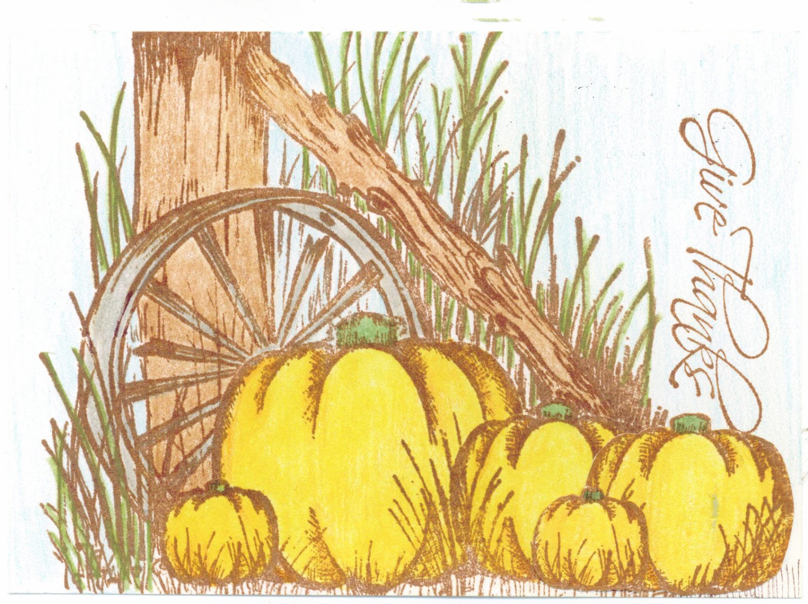
This month's letter is H for Harvest with only one colour option of heliotrope (a pinky purple).
I used an old Heartfelt Creations stamp set for the image and the text stamping it in sepia ink and colouring it in with Coloursoft pencils and solvent. As the image wasn't wide enough I added a couple of extra pumpkins.

Sunday, 15 September 2019

Monthly Challenge - September


This month's letter in the monthly postcard challenge is M for Music with colour options of mustard, magenta and maroon.
I wanted to use this very old Non Sequitur image of a singer and found a Hans Christian Andersen quote I thought would be suitable to go with it. I stamped the image and masked it before making the background with various stamps and stencils. I stamped the musical score (by Katzelkraft), then removed the mask and coloured the image with pencils and solvent. I added the computer generated words and some punched music notes.
Related Posts Plugin for WordPress, Blogger...