My inky travels along life's rocky road

Monday 30 January 2012

Less Is More 52

Thank you to everyone who commented on my entries last week. Blogger seems to have solved the problems they were having with comments so hopefully I will be able to visit more of you. This week is the 1st anniversary of the LIM challenge blog. Although I'm only a recent convert there are many regulars who have been showing their CAS cards right from the start. This week we had to follow a sketch very literally ie no slight variations at all. I used a mushroom stamp from Kars which I coloured in with my Coloursoft pencils & Sansodor and added white enamel accents for the spots. I added my lovely Stampotique moongirl and painted her wings with iridescent medium (hard to see I know). The sentiment is an old Hero Arts one. I mounted the border panel on a scrap of red card to make it stand out a bit. Hope you like it.

Saturday 28 January 2012

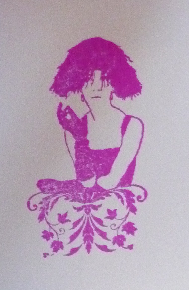
Katzelkraft Card of the Week 4

I'm joining in on the Card of the Week on the Katzelkraft forum. We were given 4 colours to use on our card. I used the CB holly border embossing folder on the cream base card. A strip of patterned paper and a strip of glossy card with sailboat blue, latte & caramel alcohol inks. The main image is from Katzelkraft's contes et merveilles plate which I stamped with Adirondack espresso and painted with Brilliance beige & sky blue inks. I added Candi dots to finish the card.

Friday 27 January 2012

Craft Barn Colour Tag

Last week on the Craft Barn blog they looked at the colour wheel and challenged us to make a tag. I found it very interesting and did some online research into hues, tints, shades & tones. This tag uses a triadic colour scheme - 3 equidistant colours on the colour wheel green, orange & purple. The background is made of Impress inks in emerald, chartreuse & spring green. The dots are an Artistic Stamper stamp and the text is from Fiskars for the birds set. I stamped the flowers (by Studio G) in spiced marmalade & rusty hinge DI, cut them out & mounted them on the tag (1 of them is on foam pads). The flower pot is a punch which I coloured with Adirondack eggplant and stamped some stripes with a Hero Arts stamp. I drew on the stems and added some candi dots and some ribbon.

Monday 23 January 2012

Less Is More (2nd entry maybe)

I'm not sure if this card is permissible under Less Is More guidelines. If it isn't please delete the link. I had this idea while I was thinking about apertures for this week's challenge. I wanted a ripped aperture revealing some eyes. It didn't quite have the impact I wanted in white so I went for black and the rest just fell into place. The stamp is one I had coveted for ages and then I saw it as part of a grab bag on ebay. I felt it was meant to be! It is stamped with Adirondack lake mist as black was too harsh. The text is computer generated.

Less Is More 51

Thank you for all your comments last week. I wanted to comment on everyone's entries but Blogger is freezing some comment sections and not letting me see some blogs at all! Hopefully I will do better this week. Cut it out was the theme this week at Less Is More - we had to include an aperture on the card. I couldn't have made this card without my stamp positioner. If you don't have one, buy or make one as it opens up a world of possibilities. Placement is key in a card like this.  I used a B Line Design stamp that I got as a gift on the LB Crafts stall at an exhibition. It's a small stamp that's been made into a necklace with beads and string. I stamped it and the text (by Inkadinkado) with Impress peony purple. The oval and the rectangle were both done with punches. I felt the bright colour needed some contrast to tone it down a bit so I went for this sagey green ribbon and bundled sage DI. The stamp in the 4 corners is another B Line Design one that matches the lady's skirt. It's actually a square but with the stamp positioner and a bit of scrap paper I managed to get it exactly where I wanted it. Hope you like it.

Monday 16 January 2012

Less Is More Take 2

You may have gathered from my post below that I was not entirely happy with my entry to this week's LIM challenge. I had to have another go. I decided to use this Crafty Individuals stamp that I bought on ebay before Christmas. I stamped it with Versafine onyx black and masked off the bird. I then used an old Hero Arts shadow stamp with spun sugar DI for the background. The text stamp is one I had made several years ago. I am much happier with this.

Sunday 15 January 2012

Less is More 50

Oooh my brain hurts after this one! This CAS lark is not easy - you have nothing to hide your mistakes under and every mark on the card has to be there for a reason. Firstly let me say how totally awed I am by all the kind comments left for my purple entry last week. I would like to thank everyone who took the time to leave a few words of encouragement, it really is appreciated. I did try and visit as many people as I could but I'm sorry it wasn't everyone.
Now onto this weeks which is a one layer card on the theme of birds. You have no idea how many bird stamps I rejected in favour of this one. They were all too big, too grungy, too ornamental, too plain etc etc etc. Finally I went with this little Studio G stamp. I was still undecided as to whether the card looked finished - it was missing something but I wasn't too sure what embellishments were allowed under the CAS one layer guidelines. The card needed a bit of colour so I tore a couple of strips of paper and sponged between them in Brilliance pearlescent orange (the colour hasn't scanned too well and is more orangey IRL). Why orange? Why not? I could have gone for blue or green but why play safe? I think it needed something more offbeat to stop it looking boring and the pearlescent sheen definitely adds more interest. I still thought it needed something else so I present bird card mark 2
Which one do you prefer?

Tuesday 10 January 2012

Half Gatefold Card

I'm not sure if this has an official name but I'm calling it a half gatefold card. The bottom (printed) part opens out gatefold style and the top flips up. This is  a card for my lovely niece who will be 13 this month. I hope she will enjoy seeing how it's made. I've used Basic Grey Eskimo Kisses paper and various diecuts.
Edited to add - I now know this is called a Double Dutch Fold Card and I 've linked to a tutorial.

Monday 9 January 2012

Travelcard Holder

front
back


I wish I had taken a pic of this before I redecorated it. It was a promotional cardholder for Shrek the musical so was a lurid green and white. DS2 had thrown it away as it was far too uncool to use. I covered it with grunge paper and used DI and various stamps and was pleased when he said he would  like to use it now. Too bad he was the one that threw it away and I think I'd like to use it! I'm debating whether to blanket stitch around the edge to secure the grunge paper to the plastic cover and make it more hardwearing.

Sunday 8 January 2012

Less is More 49

I've often admired the work on the Less is More challenge blog - the clean style appeals to me. Now I have my own blog I thought I would give it a go. This week's challenge is 'predominantly purple'. The flower stamp is the agapanthus one by Stampendous with the word stamp from Katzelkraft's Norris fleurs set stamped with Stazon vibrant violet.

UK Stampers Postcard Swap

UK Stampers have a monthly postcard swap and the theme for January is 'Numbers'. I've used tumbled glass, broken china & faded jeans DI for the background which I sponged over the waste from cutting some numbers from the CB typewriter alpha set. I also used pumice stone DI through some sequin waste. The number stamps are all by Paper Artsy stamped with a Kaleidacolor pad in spectrum. The 'Posy' image is from a grab bag I just received from a fellow UK Stampers member.

Sunday 1 January 2012

Craft Barn Art Journal 1

New Year new challenge! Happy New Year and I hope 2012 brings you peace and happiness. The Craft Barn are starting up an art journal challenge on their blog and I though I'd give it a go. First problem was I didn't have a suitable journal. My books all have thin lined paper which would not have been suitable. I have a pad of watercolour paper which I thought would work so for the moment it's pages for a journal. The theme was buildings so I used my Paper Artsy bricks & mortar sets. My BG is broken china, peeled paint & brushed corduroy DI spritzed with copper and maple Sticky Fingers sprays. I randomly stamped the sequin waste stamp from a Christine Adolph cube with pumice stone DI and circles from an Inkadinkadoo set with weathered wood DI.. The top & bottom edging is a TH vintage lace die cut and the word home is stamped with a Paper Artsy alpha. I've written along the roofs of the houses 'a house is not a home if there's no one there to hold you tight and no one you can kiss goodnight' which is the message of this page. Buildings are structures but what makes a building a home is love.
Related Posts Plugin for WordPress, Blogger...