Thank you for all your comments last week. I wanted to comment on everyone's entries but Blogger is freezing some comment sections and not letting me see some blogs at all! Hopefully I will do better this week. Cut it out was the theme this week at
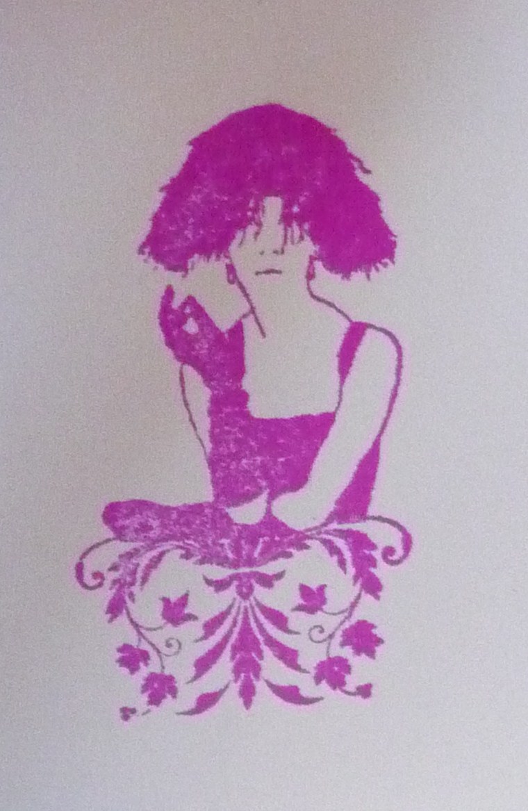
Less Is More - we had to include an aperture on the card. I couldn't have made this card without my stamp positioner. If you don't have one, buy or make one as it opens up a world of possibilities. Placement is key in a card like this. I used a B Line Design stamp that I got as a gift on the LB Crafts stall at an exhibition. It's a small stamp that's been made into a necklace with beads and string. I stamped it and the text (by Inkadinkado) with Impress peony purple. The oval and the rectangle were both done with punches. I felt the bright colour needed some contrast to tone it down a bit so I went for this sagey green ribbon and bundled sage DI. The stamp in the 4 corners is another B Line Design one that matches the lady's skirt. It's actually a square but with the stamp positioner and a bit of scrap paper I managed to get it exactly where I wanted it. Hope you like it.

Lovely card like the colour combo purple and green
ReplyDeleteMaggie
I agree with you about a stamp positioner... I wouldn't be without my few bits of Lego and acetate sheets.
ReplyDeleteI love that sentiment you used!
Thanks so much
Chrissie
"Less is More"
Love the design, your stamping is FAB.
ReplyDeleteLovely card, exact placement is key, stamp positioners are simple but so clever
ReplyDeleteThank you very much
mandi
"Less is More"
Hi There, This is wonderful, I love the colours together and the aperture is perfectly placed, great design, :0) Gay xxx
ReplyDelete