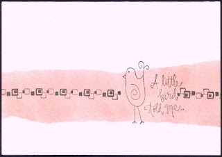
Oooh my brain hurts after this one! This CAS lark is not easy - you have nothing to hide your mistakes under and every mark on the card has to be there for a reason. Firstly let me say how totally awed I am by all the kind comments left for my purple entry last week. I would like to thank everyone who took the time to leave a few words of encouragement, it really is appreciated. I did try and visit as many people as I could but I'm sorry it wasn't everyone.
Now onto this weeks which is a one layer card on the theme of birds. You have no idea how many bird stamps I rejected in favour of this one. They were all too big, too grungy, too ornamental, too plain etc etc etc. Finally I went with this little Studio G stamp. I was still undecided as to whether the card looked finished - it was missing something but I wasn't too sure what embellishments were allowed under the CAS one layer guidelines. The card needed a bit of colour so I tore a couple of strips of paper and sponged between them in Brilliance pearlescent orange (the colour hasn't scanned too well and is more orangey IRL). Why orange? Why not? I could have gone for blue or green but why play safe? I think it needed something more offbeat to stop it looking boring and the pearlescent sheen definitely adds more interest. I still thought it needed something else so I present bird card mark 2
Which one do you prefer?


Well I like both versions... I think that your shimmer may have shown up better on a photograph rather than a scan... which I feel always seems to sap the life from cards. It's a cute image and the strip of colour was a great idea.
ReplyDeleteThanks so much
Chrissie
"Less is More"
I like the colour you have swiped across the card. Both cards look great, although my favourite is probably the bottom one.
ReplyDeleteBoth your cards are so cute, I think I like the one with the border best, hugs x x
ReplyDeleteBoth fine cards but, for me, the border lifts the coloured panel
ReplyDeleteKathyk
Two great bird cards....love your splash of colour across the middle
ReplyDeleteAnne
I think they both look great, but the second card looks more 'finished' - great choice of stamps.
ReplyDeleteI had the same problem trying to choose the 'right' bird. I like both versions of your card and like the inky panel. xx
ReplyDeleteLove this cool, funky card
ReplyDeleteReally like them both, but think I prefer the first
Many thanks
mandi
"Less is More"
I like the colour of the second card, it feels much warmer.
ReplyDeleteI am still struggling to choose a bird for my entry!
I like both of your cards, it's such a cute image.
ReplyDeleteSally x
pretty. I think I like the first one better but they're both really neat!
ReplyDeleteSo sweet. Like the saying...
ReplyDeleteTwo sweet cards.
ReplyDelete